Da Vinci

Da Vinci by Mike Venezia, 1989.

This book is part of a series of biographies of famous people from history. I’ve been familiar with the part of this series about famous artists since around the time the first ones were published. I was in elementary school school at the time, and we had the books because my mother used to teach the Art Masterpiece program at the school. She would come to class and talk about famous artists and show their paintings, and there would be an art project for the kids to do based on the style or subject matter of the artists. So, when I was young, we had books from this series (among other art books) around the house that she used for the art classes and a lot of arts and crafts materials (a tradition which exists to this day). At the moment, this is the only book from the series that I have because the book about Leonardo da Vinci was my favorite.

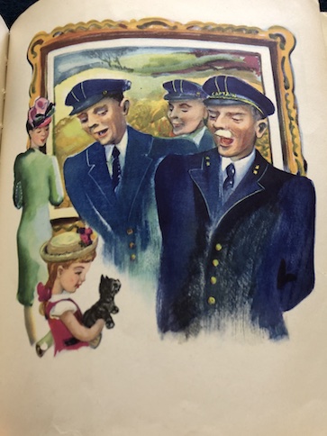
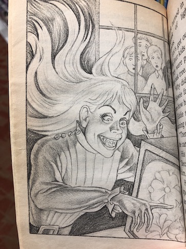
Leonardo da Vinci was one of the most famous artists of the Italian Renaissance, particularly known for his paintings The Last Supper and the Mona Lisa, but he was more than just a painter. The book is full of interesting facts about his life as well as his work. Aside from showing photographs of da Vinci’s work, the book also has humorous cartoons about da Vinci’s life, which is one of the things that makes this series of books fun.

Leonardo began showing an interest and talent for drawing while he was still a child. Throughout his life, he also developed and practiced many other skills, including architecture and mathematics, music, and sculpture. He was a scientist and inventor, experimenting in many different areas, from the mixing of different types of paints to weapons design. Along the way, he found creative ways to combine his various interests. He used his drawing skills to develop his scientific ideas, and he used his knowledge of science to make his art appear more realistic.

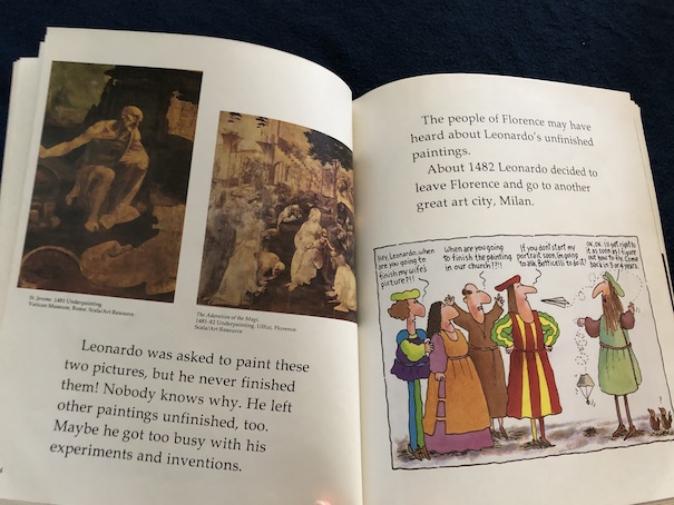
You might wonder how one person could find so much time to do so much, but part of the answer is that he didn’t finish everything he did. He is known to have left some of his work unfinished, possibly because he got distracted by other, more interesting projects and pursuits or because he just couldn’t finish them to his satisfaction. Not all of his designs for inventions really came to anything, and not all of his experiments worked out, either. Some of his paintings are now deteriorating because the experimental paints that he mixed didn’t quite work out.

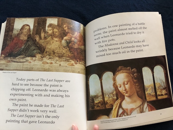
However, Leonardo da Vinci was a perfectionist, and the paintings that he did complete show excellent techniques and a high degree of realism that have been an inspiration to later artists for centuries.

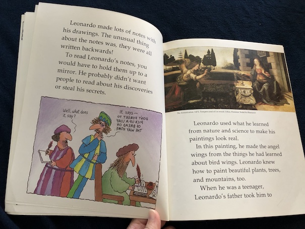
One final thing I’d like to add is that this book is part of the reason I thought The Da Vinci Code by Dan Brown was a dumb book. As I said, I grew up with art lessons. I read and loved this book about Leonardo da Vinci when I was a kid, and it has some very basic information about the life and work of Leonardo da Vinci that anybody who was seriously interested in him really should know. One of the cringiest parts of The Da Vinci Code for me was the part where our heroes are stupidly trying to figure out a message that is simply written backward. As this picture book about Leonard da Vinci points out, it’s common knowledge these days that da Vinci wrote notes using mirror writing. Some people, like the book suggests, think that he did that to make his notes harder for other people to read, although there’s also a theory that he did it because he was left-handed and that he decided that it was easier for a left-handed person to write that way. Left-handed people often complain about getting ink on their hands when they write left-to-right, but they don’t have that problem if they write right-to-left, so this might have been his attempt to get around the problem of ink-stained hands. Either way, if the people in The Da Vinci Code were such experts, they should have know this about da Vinci, and it should have been one of the first things they should have checked for. That’s not the only problem in The Da Vinci Code, but it’s one of the ones that rankled me the most because of how long I’ve known about this. (Also, The Da Vinci Code totally ripped off the albino assassin from Foul Play with Chevy Chase and Goldie Hawn, but that’s another issue.)

The book is available to borrow and read for free online through Internet Archive.

Famous French Painters

Famous French Painters by Roland J. McKinney, 1960.

This book is part of a series of Famous Biographies for Young People. Reading older non-fiction books can be problematic because non-fiction books are often updated with new information. In this particular book, there are people who are described as being still alive because they were at the time of the book’s publication, but they are not alive anymore. However, older non-fiction books sometimes interest me both because they are an indication of what people knew and studied at the time of publication and they sometimes cover odd topics that don’t commonly appear in new books. So far, this is the only book I own from this particular series, but the other biographies in the series

It begins with a section of black-and-white prints of famous French paintings and an introduction to the history of French painting in general. The introduction begins with a discussion of illuminated manuscripts in the 15th century and the artistic and architectural endeavors promoted by King Francis I in the 16th century. Francis I was particularly fascinated by Italian art, and he hired artists of the Italian Renaissance, including Leonardo da Vinci, to work at his court. Francis I helped to fuel an increasing interest in the arts in France called the French Renaissance. Although the French Renaissance was initially heavily influenced by the Italian Renaissance, French artists continued to develop their own styles. Popular subjects in French art were portraits, realistic landscapes, scenes from Classical mythology, and religious themes. The introduction ends with artists who painted during the late 18th century and early 19th century, explaining how their departure from neoclassical styles led to the development of new art styles.

After the introduction, there is a series of short biographies of famous French artists, beginning in the early 19th century and leading into the early 20th century. One of the first things that struck me about the list of artists included in the book is that, when their birth and death dates are included, none of the artists were born later than the 1880s, and the last two in the book have no death dates listed. Since the book was published in 1960, those last two artists were still alive at the time of publication, although they have died since then.

The artists included in the book are:

Eugene Delacroix (1798-1863) – He was a leader in the Romantic style of painting and one of the first French artists to use watercolor paints, which the French learned from English artists.

J. B. (Jean Baptiste) Camille Corot (1796-1875) – Originally, he trained in business, but he didn’t think he was suited to business and decided that his future was in art. He was particularly known for his landscapes, which were his specialty. He was also known as a charitable benefactor.

Edouard Manet (1832-1883) – Manet’s parents originally wanted him to become a lawyer, but it soon became apparent that he did not have the interest or temperament for a law career. When he first began his art studies, he quarreled with his teacher over the teacher’s strict insistence on realism in art because Manet preferred a more creative form of expression. He eventually developed a more simplified realistic style that did not focus on small details, a style that contributed to the development of impressionism.

Edgar Hilaire Germain Degas (1834-1917) – His specialty was portraits, and following the lessons that his teacher impressed on him, he emphasizes the importance of lines and drawing in his work. Much of his work was in oil paint, but he switched to pastels because he found that it was easier to work with and less of a strain on his eyes. Some of his best known works were of ballet dancers.

Paul Cezanne (1839-1906) – He initially doubted his own artistic talents, but a fellow painter, Pissarro, advised him to stop trying to imitate others and put his focus on studying nature. Cezanne’s association with Pissarro helped him to develop his own style.

Pierre Auguste Renoir (1841-1919) – Early in his life, Renoir was known for his singing ability, but his parents insisted that he learn a trade. He started learning how to decorate china, but this was the era when factories began using machines to decorate china. For a time, Renoir decorated fans and window shades, but his focus on improving his drawing abilities led him to a career in art. He became a friend of Monet, and the two would discuss art techniques with each other, although they had different styles.

Vincent van Gogh (1853-1890) – He was originally from the Netherlands but lived in France. He was a contemporary of Gauguin, and the two were even friends. Unfortunately, van Gogh was plagued by mental illness, leading to the fit where he cut off part of his ear after an argument sparked by ridicule from Gauguin. Eventually, he committed suicide. He was not a famous artist during his lifetime, partly due to his mental illness and early death, but his work became famous after his death.

Paul Gauguin (1848-1903) – Although he was originally from France, Gauguin is known for his travels to islands in the South Pacific, where he eventually died. Much of his work was inspired by his travels in the South Pacific.

Henri Matisse (1869-1954) – He was a leading figure in a group of artists known as the fauves, which mean “wild beasts.” They painted in an unorthodox way that included few details and ignored perspective.

Pablo Picasso (1881- ) – Picasso was originally from Spain, but he lived in France for most of his adult life. He began studying art at a young age and is known for his work in surrealism and cubism. He was alive at the time this book was written, but he died in 1973.

(Odd fact not included in the book – Picasso was actually born one day before the shootout at the OK Corral in Tombstone, AZ. It doesn’t mean anything and isn’t important, but I noticed the date and just thought I’d tell you.)

Georges Braque (1882- ) – Braque was a contemporary of Picasso, and the two artists were instrumental in the development of cubism, although they each did their own work. The collaboration between the two artists was interrupted by the outbreak of WWI. Braque was alive at the time this book was written, but he passed away in 1963. On the subject of limitations in art, he once said, “Progress in art does not lie in extending its limits, but in knowing them better.”

Something that struck me was how much artists who were contemporaries of each other worked together, met to discuss and analyze each other’s art, and were actual friends. I prefer collaboration to competition, and I like that many of these artists seemed to appreciate and learn from each other’s skills and techniques.

I was also surprised at the number of artists whose parents initially wanted them to become lawyers, like Manet, Degas, Cezanne, and Matisse.

The book is available to borrow and read for free online through Internet Archive.

The First Book of Painting

The First Book of Paintings by Lamont Moore, 1960.

This book is meant to be a beginner’s introduction to understanding and appreciating paintings. I thought it was interesting how, in the book’s introduction, it points out that the word “art” is based on the Latin word for “skill.” Art work is skilled work, and it explains how other types of skills are referred to as “arts.” Artists are people who are skilled at making things, but they also have an ability to see things more clearly than most people, form strong mental images, and convey those mental images and their feelings about them through their art.

The book is divided into sections that focus on different elements of paintings and artistic principles, explaining their role in art and providing examples of their use. The elements of paintings are line, shape, space, light, and color. The artistic principles covered in the book are pattern, balance, rhythm, contrast, and unity. Some of these sections also include suggested activities for readers to try that demonstrate these concepts.

Line – The lines of a painting define shapes in the painting. They also convey the idea of movement and direct the eyes of the viewer to important points of interest. This section shows a cave drawing a rhinoceros and suggests that readers trace it onto another piece of paper but change some of the lines to see the difference it makes.

Shape – Shapes are defined by lines. Shapes are flat, but their placement can create the illusion of depth and distance. The book suggests studying shape in drawing by drawing a friend’s silhouette.

Space – Shapes occupy and fill space. The placement of shapes within space create balance and suggest depth.

Light – Light is used to create the illusion of three-dimensional shapes because physical objects have sides that reflect light and cast shadow. It can also be used to give viewers a sense of substance because metal objects in paintings should look particularly reflective. Lighting can also convey mood in a painting. Part of this section explains how impressionists use light to give paintings more of an appearance of depth when viewed at a distance.

Color – The colors help to convey the mood of the painting. Certain colors also look better in combination with each other.

Pattern – Patterns are repeated features, like repeated shapes, lines, colors, and/or repeated light and dark spaces. Patterns can be used turn a few simple elements into part of a larger concept.

Balance – The concept of balance means that elements of a painting should balance each other, like placements of shapes and objects, points of interest, and areas of dark and light colors. If elements are out of balance, it can unsettle the viewers and give them the impression that something is wrong and needs to be fixed.

Rhythm – Rhythm in a painting suggests movement and energy, like the subjects of a painting are alive and moving.

Contrast – Contrast in a painting creates visual interest. If the elements of a painting are too much alike, they can look dull. The contrast could be in the placement and grouping of elements in the picture (such as some objects in the picture being grouped while others are isolated) or contrast between light and dark elements, making some of them stand out from others.

Unity – Unity refers to how well all of the elements of a painting combine to form a whole. All of the previously listed aspects of a painting need to work together effectively to convey the subject of the painting and the mood and message of the artist.

One of the things I like about this book is that is uses a wide selection of paintings from different countries and time periods as its examples, from cave paintings and paintings on Grecian pottery to Renaissance portraits and modern art.

At first, when I was reading the book, I was annoyed that almost all of the pictures of paintings in the book are black-and-white. Then, I discovered that the pictures in the chapter about the use of color in paintings are full color. That is the only place in the book (aside from the cover) where there are color images. I think the reason why they did that is to draw attention to the colors in that chapter while emphasizing other aspects of painting in the other chapters, but I think I would still prefer more color images throughout the book.

The book is available to borrow and read for free online through Internet Archive.

The FunCraft Book of Print and Paint

The FunCraft Book of Print & Paint by Heather Amery and Anne Civardi, 1976.

This is the American edition of a British book, and it’s part of a series of craft and activity books. When I was a kid, I was really into crafts, but I didn’t do even half of the crafts in the craft books we had. This particular book is interesting because I first thought that it was going to be about painting pictures, and it is, but it’s specifically about making “prints” with paint. Basically, the crafts involve using various objects, from leaves and veggies to your own hands and fingers as stamps to make pictures and designs.

I remember once taking part in an activity at our local library that involved making pictures with stamps make from cut potatoes, like the book shows in the section about vegetable prints. Our potato stamps weren’t as elaborate as the ones shown here, and it’s interesting that they thought of using other veggies to get some different shapes as well.

The range of objects and techniques that the book uses in making prints is also interesting. It points out that you can make some interesting patterns by painting on a page and folding it over or using string coated in paint to make swirls. There are tips for making using tools like stencils and rollers to make designs.

The book also includes some painting techniques, like how to mix colors, and some tips for how to enhance pictures you’ve made, like painting over parts of a picture with glue and then shaking on some powdered colors. It gives suggestions for different powdered colors, like colored sand, salt, or sugar or using powdered spices or cocoa from your kitchen (more expensive, but it will give your artwork a scent).

One of my favorite suggestions was a technique that I did like a lot when I was a kid, making scratch pictures with a simple form of sgraffito. You can buy kits and specially prepared paper for doing this today, which didn’t exist when I was a kid (at least, not anywhere where I could buy it). Instead, I had to do it the old-fashioned way, using the technique in this book – drawing a rainbow of colors on paper, covering of it with black, and then scratching the black off to make rainbow pictures and patterns.

There are too many tips and techniques for me to cover everything in detail. The last few pages cover uses of the techniques for specific projects, how to make prints on cloth, and how to have an exhibition of the pictures you’ve made.

The book is available to borrow and read for free online through Internet Archive.

Drawing Fun

Drawing Fun by Carolyn Davis and Charlene Brown, 1988.

This book is part of the Beginners Art Series, and it teaches children basic drawing skills. The book is designed for readers to try out drawing techniques on their own as they read along and starts with a page that explains the materials they will need.

Because this is a beginning guide, the book begins by explaining that all objects and, therefore, all drawings, are made up of basic shapes. One of the keys to learning how to draw is studying the basic shapes and how they can be combined to create more complex shapes and drawings.

When beginning to draw, the reader should begin by sketching out the general shapes that make up what they’re drawing and then fill in the details.

Many of the drawing activities in the book focus on tracing shapes, drawings, and photos to learn how they are formed and practice drawing skills.

As the book continues, the techniques become more advanced and the drawings become more detailed. It gradually teaches readers how to use shadows and shading to make their drawings appear more realistic and three-dimensional. The subject matter of the drawing exercises ranges from basic apples to more interesting subjects, like teddy bears and people.

The book also explains how to use perspective in drawing to further add a three-dimensional quality.

I like this book because I think it’s a good introduction to a fun, artistic hobby, giving readers good beginning techniques.

The book is available to borrow and read for free online through Internet Archive.

Patty Paints a Picture

Patty Paints a Picture by Laura Bannon, 1946.

Patty wants to paint a picture of her kitten, Happy, to hang in her room. However, she has trouble creating a painting that truly satisfies her. Her first attempt doesn’t really look like her kitten. Patty is taking an art class at a local museum, and her mother suggests that she take her picture of Happy to her teacher and ask her how to make it better. Through Patty’s efforts to paint a realistic picture of her kitten, she comes to learn more about art.

Patty’s teacher suggests that Patty actually bring her kitten to class so that everyone can observe and paint him. When Patty takes her kitten to her art class, the whole class looks at Happy, pointing out parts of the the cat, like his whiskers and his little padded feet with retractable claws. Every part of Happy, including the shape of his eyes and his powerful back legs that are good for jumping, is suited to making him a good hunter because cats often hunt for their food. Studying the form of the cat helps the children understand how to draw him.

The fun part of the book is when Patty studies all of the different ways her friends in class draw the kitten, seeing how everyone looks at the kitten differently and uses different art styles, some drawn better than others because all the artists are children. The children’s pictures in the book look like pictures that would be painted by real children.

The children in the art class paint the cat in different ways and different imagined settings, indoors and outdoors, depending on their interests and how they see the cat and his personality. The boy who drew Happy in a cartoon style, with a bird in his stomach and a caption, wants to be a cartoonist, which is why his style was a good choice for his painting. Patty, on the other hand, wants her painting to be realistic for the way she sees her kitten.

The book explains how Patty learns new art techniques to make her painting look more realistic. She studies the lines that people use in their paintings and compares them to her cat, seeing that curved lines for the cat’s body make him look more realistic. Patty’s teacher points out that one of the mistakes that she’s made in her first efforts is giving Happy a body more the size of an adult cat than a kitten. A kitten’s body looks smaller when compared to the size of the head. To make her picture more realistic, Patty has to learn to draw her kitten’s body parts and features in the right proportions. Patty also notices that the edges of another girl’s cat painting look fuzzy because she’s painting in watercolor and the edges of her painting are wet and running. Patty likes the fuzziness of that painting, so she decides to use that technique on purpose to make more realistic, fuzzy fur. Her teacher shows her how to use that technique with more control by putting a wet blotter under her paper. I like how the book describes Patty’s observations of both her kitten and other people’s pictures and how she uses them to improve her own painting.

At one point in the story, Happy disappears from the art class, and Patty is afraid that she’s lost her kitten forever. Fortunately, she finds Happy hiding in the art room, taking a nap, and he is fine.

In the end, Patty produces a painting that satisfies her because it really looks like her kitten, the way she sees him.

This is one of those vintage children’s books that I would like to see in print again! It’s a nice story, and I really liked the way the book examines the different ways that people look at art and the styles they use. There’s no wrong way to paint something, but the book explains how learning different techniques can help artists to express themselves and their vision the way they want. Patty knows when she’s doing well at her painting when the picture she paints looks more like the vision she has of her kitten.

You can read this book online in your browser through the HathiTrust Digital Library.

From the Mixed-Up Files of Mrs. Basil E. Frankweiler

From the Mixed-Up Files of Mrs. Basil E. Frankweiler by E.L. Konigsburg, 1967.

Twelve-year-old Claudia Kincaid is bored with her dull suburban life in Connecticut with her parents and her brothers. Her life also often seems unfair, like she has more responsibilities than her brothers do and she has more chores than her others friends. Basically, Claudia is bored and feeling unsatisfied with her life. She wants to get away from it all and have a little adventure … although not too much adventure because Claudia isn’t the overly-adventurous type.

Claudia is cautious and methodical. When she plans to run away from home, she carefully plans every step and invites her more adventurous nine-year-old brother Jamie to go with her, both for the companionship and because he is a tightwad and has the cash necessary to fund their adventure. Although Claudia and Jamie bicker as siblings, they’re closer to each other than to either of their other brothers. Jamie eagerly accepts Claudia’s proposition to run away, although at first, he’s a little disappointed when he finds out where they’re going.

Claudia plans for them to run away to New York City because, as she puts it, it’s “a good place to get lost.” The city is so big, Claudia is sure that two runaway children will be easily overlooked. She’s also found a great place for them to stay during their adventure: the Metropolitan Museum of Art. Claudia loves comfort, convenience, and beauty, and the museum can offer all of that without the fees of staying in a hotel. There are exhibits of furniture, which provide them with a bed to sleep in, and interesting exhibits to keep them entertained and educated, and all they have to do is evade the security guards. At first, Jamie thinks that sounds a little too tame, but their adventure soon proves to be exciting and challenging, with enough mystery to satisfy both of them.

Claudia and Jamie develop routines for sneaking around the museum, evading the guards, hiding the backpacks and instrument cases that hold their clothes, and raiding the coins in the fountain for extra money. One day, while they’re hiding in the restrooms and waiting for the museum staff to leave, the staff set up a new exhibit for an angel sculpture sold to the museum by the wealthy and mysterious widow Mrs. Basil E. Frankweiler, who is actually the person narrating Claudia and Jamie’s story in a letter to her lawyer.

Claudia develops a fascination for the angel and a desire to learn the truth about the theory that the statue was made by Michelangelo. Between the two children, Claudia is the more imaginative and romantic, but Jamie’s logical mind and zest for adventure serve them well as they delve deeper into the mystery. They do learn something important at the museum, but to get the full truth, they have to leave their planned hiding place in the museum and go see Mrs. Basil E. Frankweiler herself.

Mrs. Frankweiler is a delightfully eccentric student of human nature, who is fascinated by the young runaways who come to her for answers to a mystery hundreds of years old. In exchange for the details of their exploits, Mrs. Frankweiler gives the children a chance to locate the answers they’re seeking in her strange, mixed-up files. In the process, the children learn a secret that gives both of them the sense of being part of something secret and exciting and much bigger than their ordinary, hum-drum lives, which is what they were originally looking for when they ran away from home.

The book is a Newbery Award winner, and it is available to borrow for free online through Internet Archive (many copies).

My Reaction

During the course of the adventure, Claudia and Jamie become closer to each other than they were before they ran away from home. They learn a little more about each other and themselves, and neither of them is quite the same as they were before they started, which is at the heart of Claudia’s reasons for wanting to run away from home in the first place. The language and descriptions in the book are colorful, which is part of the reason why this book is popular to read in schools.

There were two movies made of this story. One is a made-for-tv movie version from 1995, although it changed some of the details from the original story. In the 1995 movie, there is a scene with Jamie getting sick and Claudia worrying about him and taking care of him that never happened in the original book. Also, in the movie, Claudia stops Jamie from taking the coins from the fountain when they had no qualms about raiding the fountain for money in the book. At the end of the book, the children don’t tell their parents where they were hiding when they return home, but in the movie, the parents do find out. There is also an older movie from 1973 which is sometimes called The Hideaways.

Tricky Pix

Tricky Pix: Do-It-Yourself Trick Photography by Paula Weed and Carla Jimison, 2001.

This book is part of the classic children’s hobby and activity series from Klutz Press and explains how to perform trick photography. Originally, this book came with a real camera that could be used to take trick pictures. The camera was a film camera instead of a digital camera, using 35mm film, but the film was not provided.

Now, digital cameras have almost entirely replaced film camera for popular photography, and film is actually much harder to come by, and not as many places offer film development services. In the very early 2000s, when this book was first published, digital photography was just starting to take hold, and digital cameras were more expensive, so a kid’s first camera was still likely to be a film camera. In just a few more years, that shifted abruptly with the increasing popularity of cell phone cameras and further developments that made digital cameras increasingly affordable for general use. The beginning of the book explains how the camera works and how to load the film.

The fact that this book was designed to be used with a film camera is important because this style of trick photography relies on physical illusions, not images that are digitally altered with Photoshop or similar software. In a way, this makes the pictures more interesting because they are largely unaltered from their original form. That is, you’re seeing what the camera saw at the moment that the picture was taken. The tricks involve using different perspectives and camera angles to achieve the illusions.

Strategic poses and the use of physical objects to block part of the scene can be used to create illusions like disembodied heads, people with extra limbs, or people with really long legs or bodies.

An often-used trick for making people look tiny enough to be picked up or stepped on by another person involves forced perspective – strategic positioning the subjects so that there is physical distance between them but no visual cues to indicate just how much distance there is between them so relative sizes are difficult to gauge.

When images in this book are altered, it’s with the old-fashioned method of literally cutting and pasting them onto each other, something that is now done digitally.

Personally, I enjoyed the fact that there was less of a reliance on software and digital technology in the production of these photographs. I think that learning how to do things without relying on technology to do most of the work can encourage creativity, and in particular, the use of physical illusions like forced perspective is also educational. Artists need to understand the use of physical space, perspective, and lighting, and these photographic tricks demonstrate these concepts well. Even though this book doesn’t make use of digital photography, any of the tricks in this book could also be performed when taking pictures with a digital camera.

The book is available to borrow and read online through Internet Archive.

From Junk to Jewelry

From Junk to Jewelry by Beth, Leah, and and Mary Johnson, 1991.

I bought this book at a school book fair when I was a kid, and we used some of the projects in the book for Brownies and birthday parties. They are pretty easy craft activities that use basic materials that people have around their houses. As the title indicates, the focus is on reusing things that might otherwise be thrown away to make something new. It uses the term “recycling” rather than “upcycling” (which I don’t remember hearing in the 1990s – “recycle” or “reuse” were more common terms), but that’s the basic idea. Some projects require some additional materials beyond the “junk”, like earring, pin, or barrette backings, but the main decorative part of the jewelry pieces are made from recycled materials. The projects in the book are divided into different levels of difficulty: beginning, intermediate, and advanced.

The two beginning projects are a beaded necklace with beads made from rolled paper (mine is shown in the picture) and pins or barrettes made from papier-mache colored with paint or marker.

The intermediate section has instructions for basic friendship bracelets and sgraffito earrings. “Sgraffito” is an artistic technique that involves scratching the top layer of a project to show the colors of a lower layer. Now, you can buy ready-made kits with special scratchable paper or cards that shows rainbow colors underneath, but I don’t recall ever seeing these kits when I was a kid in the 1990s. This project produces a similar look, but you have to apply the colors yourself using crayons. You start with a piece of heavy paper, tagboard, or an old file folder, you color rainbow stripes with crayon, pressing hard as you color. Then, you color over the rainbow colors with black crayon until the rainbow underneath doesn’t show. Then, you cut out the shapes of the earrings and scratch a design on the surface, scratching away the black surface so that the colors show underneath. Then, you glue the colored paper shapes to pieces cut from a plastic milk carton for stability and attach earring wires.

The advanced section has instructions for two more types of friendship bracelets (the v-design, which I’ve made many times myself with yarn, and the bridge design) and making origami earrings using either origami paper or colorful wrapping paper and earring backings.

The end of the book has a collection of tips for making junk jewelry of various kinds for kids of all ages. It describes various types of “junk” you can collect around the house, like old buttons, pieces of broken toys or broken jewelry, pictures cut from magazines, and bits of cloth, lace, cord, or bows. When you’ve assembled your “junk”, you consider how you can arrange it decoratively, and then glue the pieces to a piece of plastic cut from a milk jug. Then, you can attach pin backings or earring backings so you can wear it.

Environmentalism and the concept of recycling were gaining increasing importance through the 1990s and were heavily promoted in schools when I was a kid. Although not every project in this book uses entirely recycled materials, these were common sorts of projects we would do in scouts and craft classes, and they can be a lot of fun even for kids today. When I was a Brownie, we spent a weekend at a Girl Scout camp with girls from other troops, and one of our activities was creating and trading “swaps” – decorative pins we made ourselves from bits and pieces of things like this. Each troop had its own swap design, and we would trade our swaps with each other and wear them around as signs of our new friendships. I can’t remember what my troop’s swaps looked like anymore because I traded away all of the ones I’d made myself, but I still have the swaps that I got in return. No two look alike. There were pins made from old puzzle pieces, popsicle sticks with stuff glued to them, macrame rope made to look like little faces, plain safety pins with colorful beads added, etc. These are good projects to encourage creativity. If the kids are bored this summer, try some of these projects or come up with some creative twists of your own!

Aliens Don’t Wear Braces

The Adventures of the Bailey School Kids

#7 Aliens Don’t Wear Braces by Debbie Dadey and Marcia Thornton Jones, 1993.

One day, while Mrs. Jeepers’ class is getting ready to take a science test, they hear a strange sound, and the lights mysteriously flicker.  Eddie tries to ask Howie what’s going on, but Mrs. Jeepers sends him to the principal’s office for talking during a test. 

In the office, things are chaotic because the art teacher, Mr. Gibson, is missing, and the second grade teacher is there with her students, asking where the art teacher is.  Eddie meets a strange, pale woman with long, white hair and braces on her teeth.  She says that her name is Mrs. Zork and that she is there to apply for a teaching job.  The principal asks her if she can teach art, and she says that art is her specialty, so the principal hires her as an emergency replacement for the art teacher.  The principal is relieved that a substitute was so handy, but Eddie thinks that it’s a creepy coincidence.

When Mrs. Jeepers takes her class to the art teacher, she is also surprised that Mr. Gibson is gone and questions Mrs. Zork about it.  Mrs. Jeepers says that she saw Mr. Gibson only that morning, and Mrs. Zork tells her that he “had to leave . . . unexpectedly.”  Mrs. Jeepers tells her class to behave for the substitute, but she also seems somewhat suspicious of Mrs. Zork.

Mrs. Zork ignores Mr. Gibson’s previous lesson about totem poles and starts teaching the children pottery.  She seems confused by ordinary expressions, like “you’re all thumbs” and “This place is a zoo.”  When Mrs. Zork escorts Liza to the nurse for a nose bleed, the kids make other discoveries.  A jar of green paint has suddenly turned white, and Mrs. Zork has an old newspaper clipping about a UFO and a star map with a course plotted on it.  Howie, whose father works for the Federal Aeronautics Technology Station, suspects that Mrs. Zork might be an alien.

The kids spy on Mrs. Zork while they’re at recess.  They see her watching a cartoon show on tv, and suddenly, all of the color drains out of it.  It could have been because there was something wrong with the tv, but the kids notice that Mrs. Zork’s braces flash pink afterward, and her hair starts to look more blonde and her cheeks more pink.  Worse still, after Mrs. Zork admires Mrs. Jeepers’ green brooch, suddenly the brooch (as well as Mrs. Jeepers’ hair and eyes) loses some of its color and no longer works in its usual magical way.  Eddie sees it as an opportunity to goof off, and Mrs. Jeepers seems alarmed and leaves the room abruptly.

The children are worried about Mrs. Jeepers, and they can’t help but notice how the art room is looking increasingly drained of color while their new art teacher is getting more and more colorful.  It becomes more and more obvious to Howie that Mrs. Zork is stealing colors from Earth!

This is one of the books where the kids get the most proof of their suspicions, actually seeing Mrs. Zork’s spaceship in her garage.  Even so, Howie’s father doesn’t believe him when he tries to explain the situation to him.  Mrs. Zork tries to convince the children that the spaceship is actually her pottery kiln.  The kids know that somehow, they have to get their colors back to help Mrs. Jeepers and get rid of Mrs. Zork!  Mrs. Jeepers may be creepy, but at least she doesn’t steal colors or give them eternal math problems, like Principal Davis.

The book is available online to borrow for free through Internet Archive.