
The First Book of Paintings by Lamont Moore, 1960.
This book is meant to be a beginner’s introduction to understanding and appreciating paintings. I thought it was interesting how, in the book’s introduction, it points out that the word “art” is based on the Latin word for “skill.” Art work is skilled work, and it explains how other types of skills are referred to as “arts.” Artists are people who are skilled at making things, but they also have an ability to see things more clearly than most people, form strong mental images, and convey those mental images and their feelings about them through their art.
The book is divided into sections that focus on different elements of paintings and artistic principles, explaining their role in art and providing examples of their use. The elements of paintings are line, shape, space, light, and color. The artistic principles covered in the book are pattern, balance, rhythm, contrast, and unity. Some of these sections also include suggested activities for readers to try that demonstrate these concepts.

Line – The lines of a painting define shapes in the painting. They also convey the idea of movement and direct the eyes of the viewer to important points of interest. This section shows a cave drawing a rhinoceros and suggests that readers trace it onto another piece of paper but change some of the lines to see the difference it makes.
Shape – Shapes are defined by lines. Shapes are flat, but their placement can create the illusion of depth and distance. The book suggests studying shape in drawing by drawing a friend’s silhouette.
Space – Shapes occupy and fill space. The placement of shapes within space create balance and suggest depth.
Light – Light is used to create the illusion of three-dimensional shapes because physical objects have sides that reflect light and cast shadow. It can also be used to give viewers a sense of substance because metal objects in paintings should look particularly reflective. Lighting can also convey mood in a painting. Part of this section explains how impressionists use light to give paintings more of an appearance of depth when viewed at a distance.
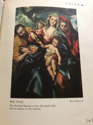
Color – The colors help to convey the mood of the painting. Certain colors also look better in combination with each other.
Pattern – Patterns are repeated features, like repeated shapes, lines, colors, and/or repeated light and dark spaces. Patterns can be used turn a few simple elements into part of a larger concept.
Balance – The concept of balance means that elements of a painting should balance each other, like placements of shapes and objects, points of interest, and areas of dark and light colors. If elements are out of balance, it can unsettle the viewers and give them the impression that something is wrong and needs to be fixed.
Rhythm – Rhythm in a painting suggests movement and energy, like the subjects of a painting are alive and moving.
Contrast – Contrast in a painting creates visual interest. If the elements of a painting are too much alike, they can look dull. The contrast could be in the placement and grouping of elements in the picture (such as some objects in the picture being grouped while others are isolated) or contrast between light and dark elements, making some of them stand out from others.

Unity – Unity refers to how well all of the elements of a painting combine to form a whole. All of the previously listed aspects of a painting need to work together effectively to convey the subject of the painting and the mood and message of the artist.
One of the things I like about this book is that is uses a wide selection of paintings from different countries and time periods as its examples, from cave paintings and paintings on Grecian pottery to Renaissance portraits and modern art.
At first, when I was reading the book, I was annoyed that almost all of the pictures of paintings in the book are black-and-white. Then, I discovered that the pictures in the chapter about the use of color in paintings are full color. That is the only place in the book (aside from the cover) where there are color images. I think the reason why they did that is to draw attention to the colors in that chapter while emphasizing other aspects of painting in the other chapters, but I think I would still prefer more color images throughout the book.
The book is available to borrow and read for free online through Internet Archive.
