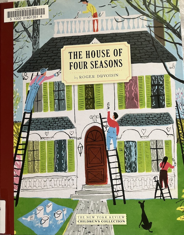
The House of Four Seasons by Roger Duvoisin, 1956.
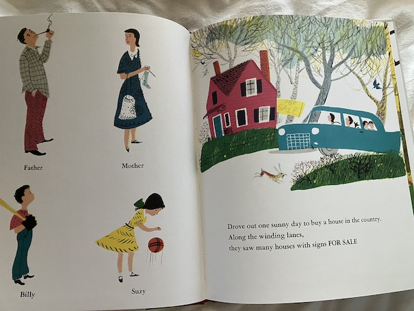
A family is searching for a house to buy in the countryside. They find one they love, but it needs some fixing up. Along with the repairs, the house needs a new coat of paint.
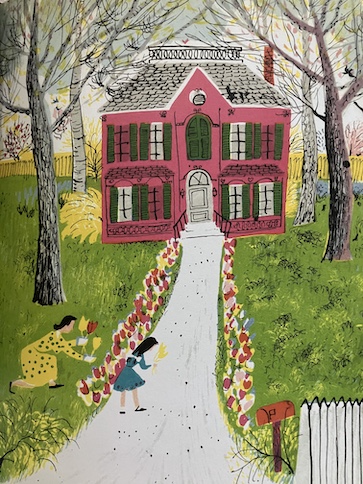
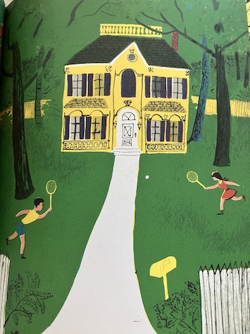
Different family members have different ideas about the best color to paint the house. Little Suzy likes the idea of painting it red with green shutters because she thinks that would look wonderful in the spring. Billy likes the idea of making it yellow with purple shutters, which would be great in summer. Their mother like the idea of a brown house with blue shutters because she thinks that would look great in autumn. Father suggests a green house with orange shutters because he thinks that would be colorful in the winter, when it snows.
They talk over the different possible color combinations, and Billy suggests that each of them could have their colors on a different side of the house. He says that they could call it the House of Four Seasons. However, when they go to the hardware store, they learn that the store only stocks three colors of paint – red, yellow, and blue.
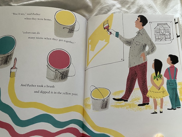
At first, the children in the family think they can’t have their House of Four Seasons with only three colors, but their father buys some of each color and shows them how the colors combine to make different colors. By mixing two colors together, they can also make orange, green, and purple. If they mix all three together, they can get brown.
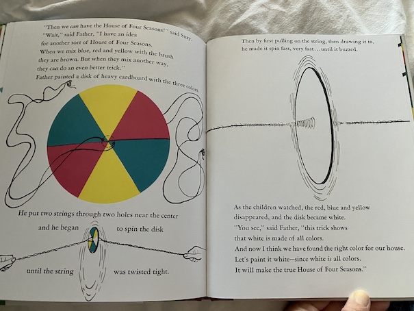
That covers all of the colors they originally thought of using, but there’s one more thing that Father points out. Although mixing all three colors of paint gives them brown, white is also the sum of all colors. That gives them a color they can all agree on!
My Reaction
I liked how the book demonstrated color combinations and how mixing primary colors make secondary colors. It is true that, when you mix all the primary colors of paint, you typically do get a brown color. Technically, according to an art class I once took, you’re supposed to get black by mixing all colors, but it usually doesn’t work out that way because the colors aren’t entirely true hues.
I’ve thought before that it’s interesting how, when it comes to paint, black is supposed to be the sum of all colors and white is often considered blank, the absence of color, but the opposite is true when it comes to light. These two ways of mixing colors are called “additive” and “subtractive” – mixing colors of light is additive and mixing physical colors, like paint, is subtractive. That’s really what the father in the story demonstrates, how different colors blend to form white visually with light, although he doesn’t really explain the additive vs subtractive color systems concept. If you’ve ever done web design, you’ve used the additive color mixing method with hexadecimal colors. Black in hexadecimal is #000000, the complete absence of all colors, while white is #FFFFFF, the full amount of all colors.
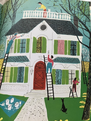
As fascinating as that is, though, I have to admit that I wasn’t entirely satisfied with the choice to paint the house white. Part of it is that it won’t stand out in the snow when it’s white, and part of it is that they just paint the shutters green without any discussion about it, but mostly, it’s because … the hardware store doesn’t sell white paint. They clearly stated that the hardware store only has three colors of paint – red, yellow, and blue – no white. They also can’t combine those colors to make white because they already demonstrated that combining those three colors makes brown. Combining colors to make white works with light but not paint.
It’s still a fun story that has some educational quality, but yeah, I realized that the proposed plan to use white paint actually wouldn’t work. Unless, of course, they just go to a different hardware store, one that has a wider paint selection.
The pictures really make this story stand out as being from the 1950s. The father is smoking a pipe, which is uncommon these days and almost never depicted in 21st century children’s books. Even in the late 20th century, when I was young, people were cracking down on depictions of tobacco use in children’s books and movies to discourage children from normalizing tobacco and using it themselves. The overall art style of the book is typical of the mid-20th century, but it has a full range of colors, in keeping with the theme of the book. Some other mid-20th century books were printed with limited color range.
I liked seeing the house depicted with the different color combinations that members of the family imagined, and I enjoyed how they associated the color combinations with different seasons of the year. Some of their color combinations are very unusual, like yellow and purple together on the house. Few people would choose such a combination in real life, although yellow and purple are complementary colors on the color wheel. So are red and green, the color combination that the daughter of the family would have chosen. I thought that it was interesting that the color combinations the family considered were all either complementary colors or leaned in that direction, although they never mentioned it in the book or explained what complementary colors are. Complementary colors are directly opposite each other, and they can be used to create contrast and visual appeal.
One of the things I like about seeing the different color combinations is that it invites children to consider what color combinations they would choose themselves. It reminded me a little of Katy Comes Next, where readers get to see the wigs, doll eyes, and doll clothes that Ruth chooses among for her doll, Katy, and imagine which ones they would choose. I think kids like to see different possibilities and consider their choices and favorites.
